Brand packaging design | Illustration | Photography
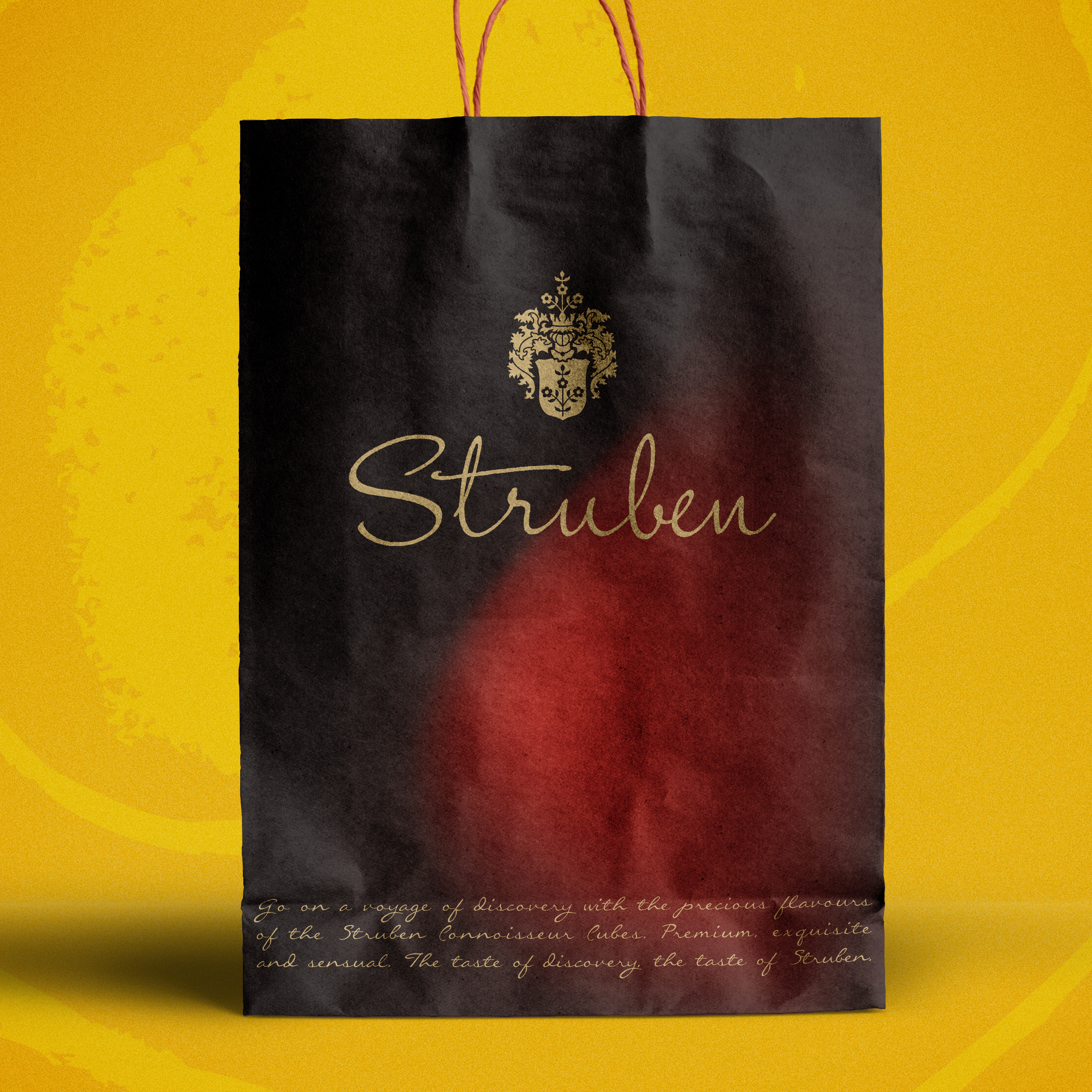
Helping a luxury chocolatier Struben bring to life a brand with a rich history and unique story to tell through a refreshed identity, new packaging that met the challenges of online retail whilst being relevant to an ever more discerning audience. The work ranged from initial research through to strategy, identity design, packaging and a portfolio architecture.
Key areas of expertise
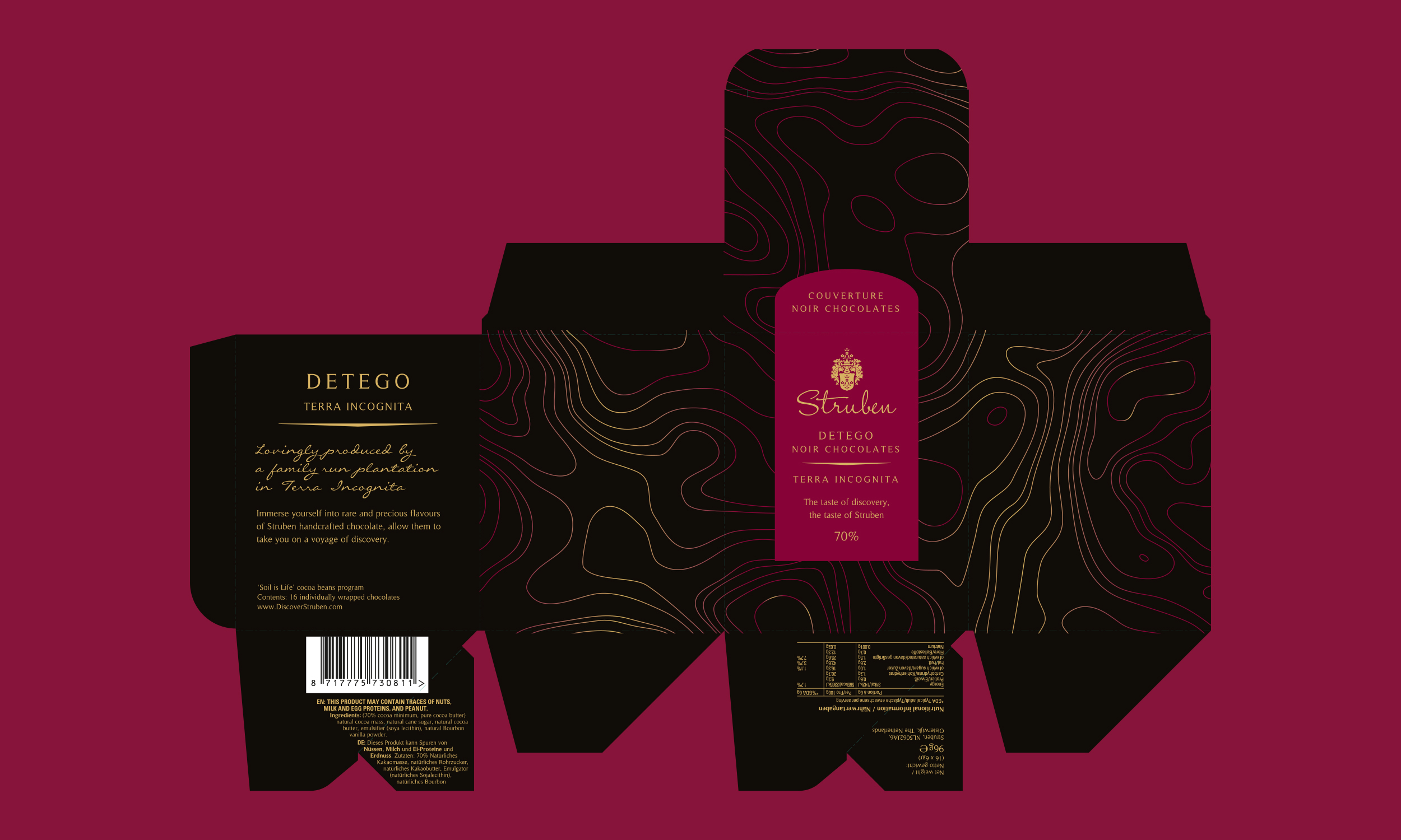
The story starts in 1884 with the pioneering Strubens developing a taste for discovery and adventure in the New World when Johnas Struben emigrated to South Africa with his young family. Early mining expeditions by his sons led to the establishment of the ‘Confidence Reef’ gold mine and the family was at the forefront of the prospecting revolution. That same Struben spirit still inspires today as the latest generation continues their journey, sourcing the finest cocoa from around the world to create a unique Couverture Chocolate Collection.
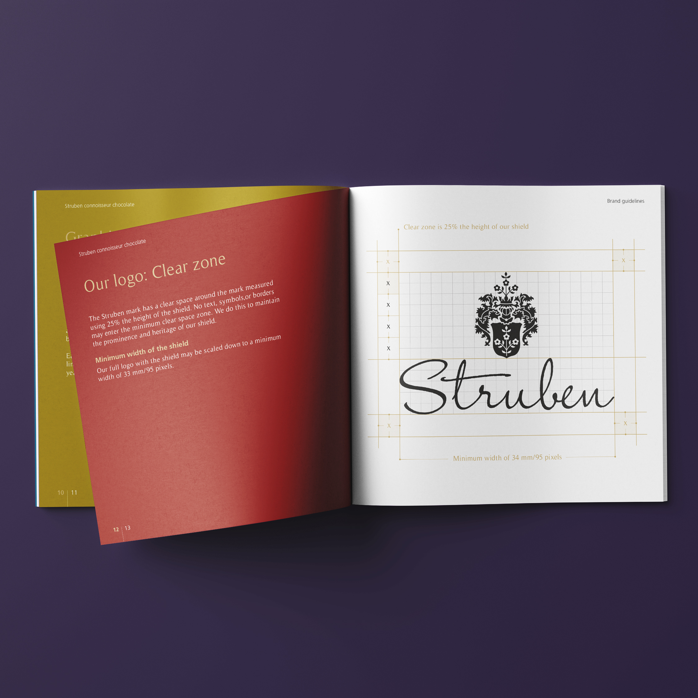
In response to the initial brief and current branding, it was clear Struben’s brand mark required an evolution. Their family crest forms an important part of their heritage, so retaining this brand mark was key. The first step in the process for this brand refresh was to set about refining and simplifying the crest design giving the mark with a more modern treatment.
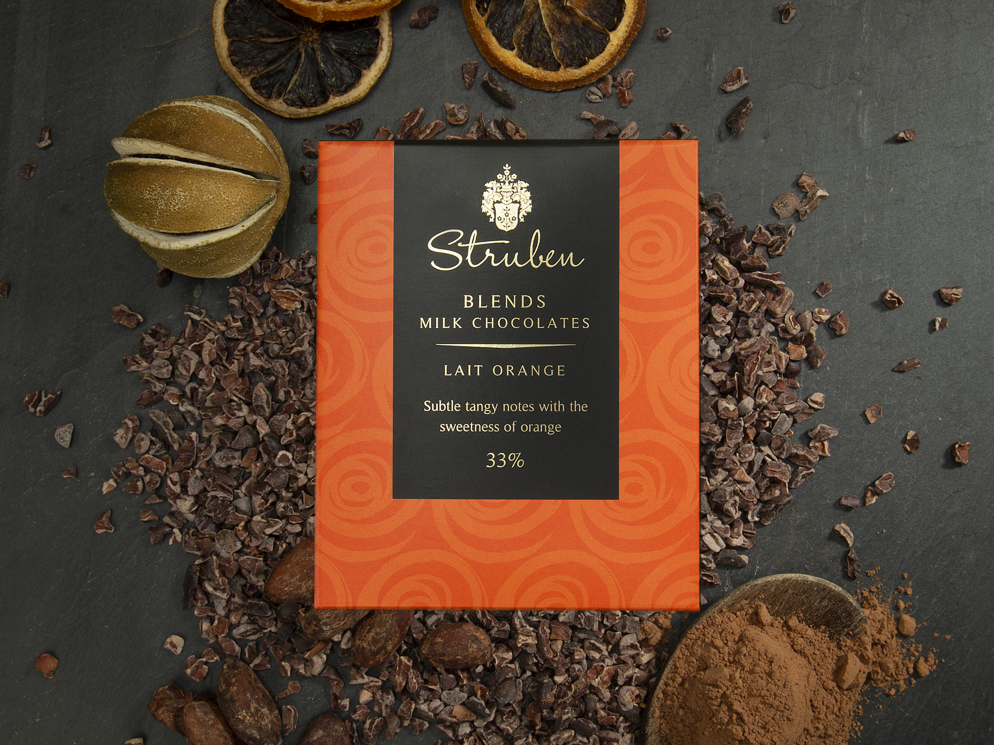
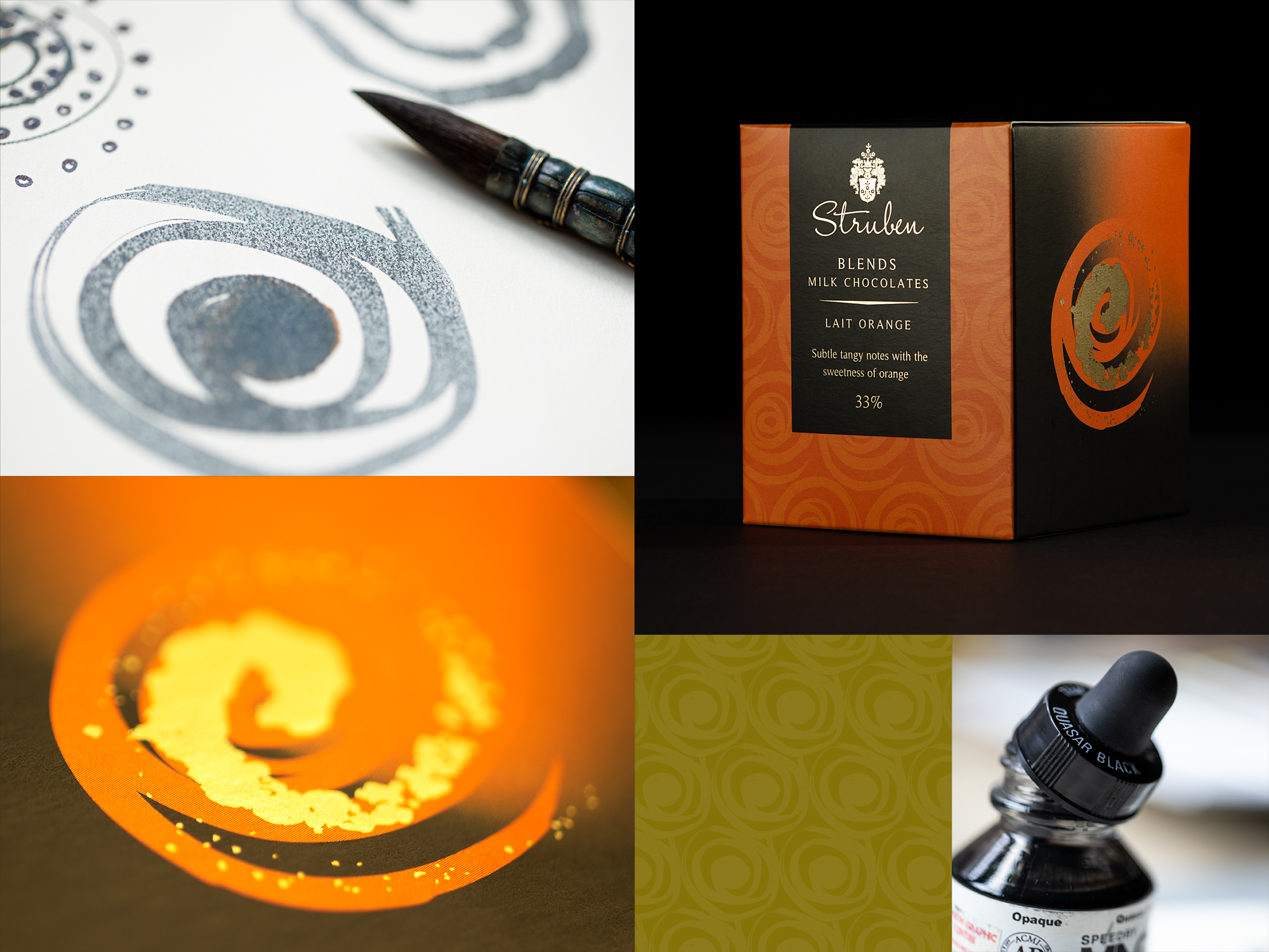
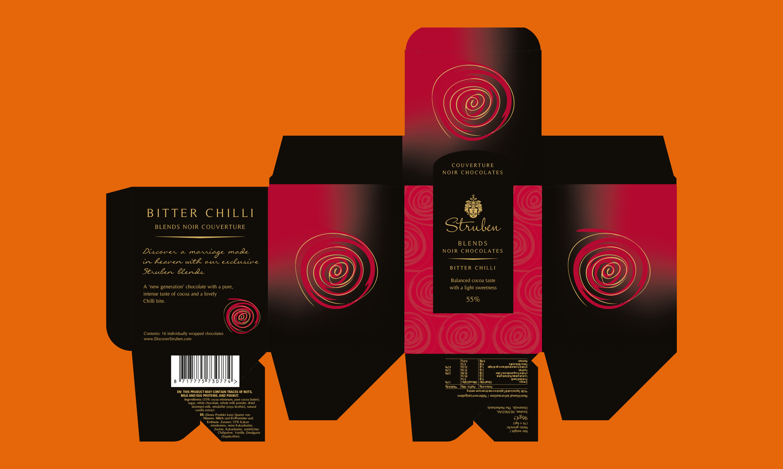
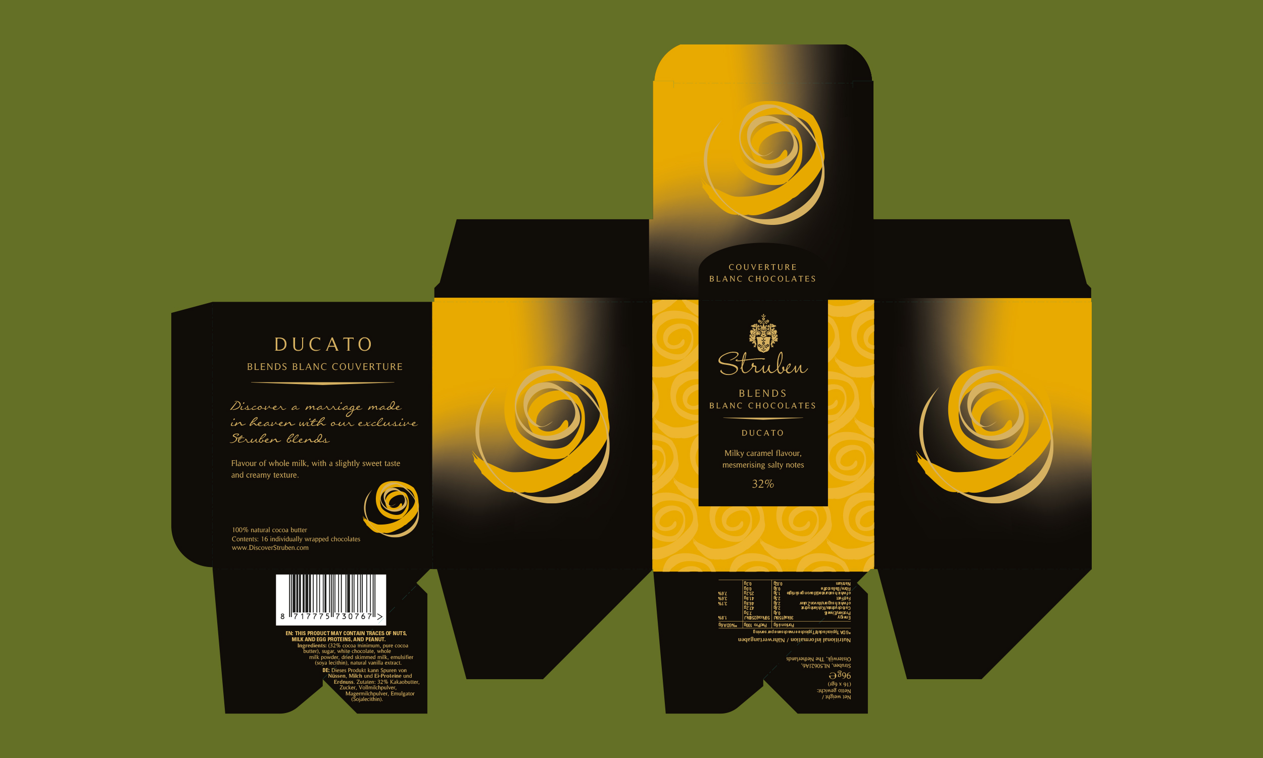
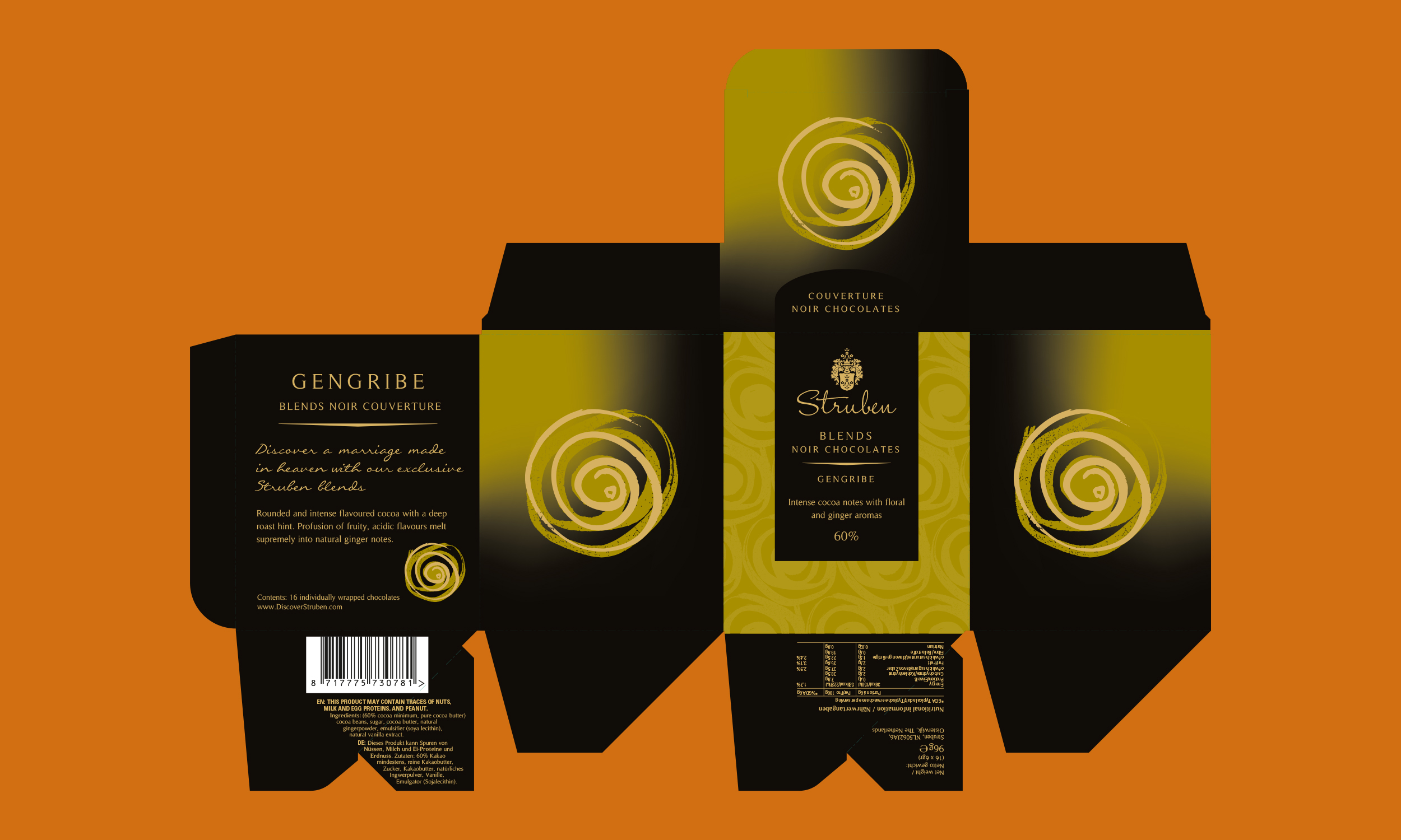
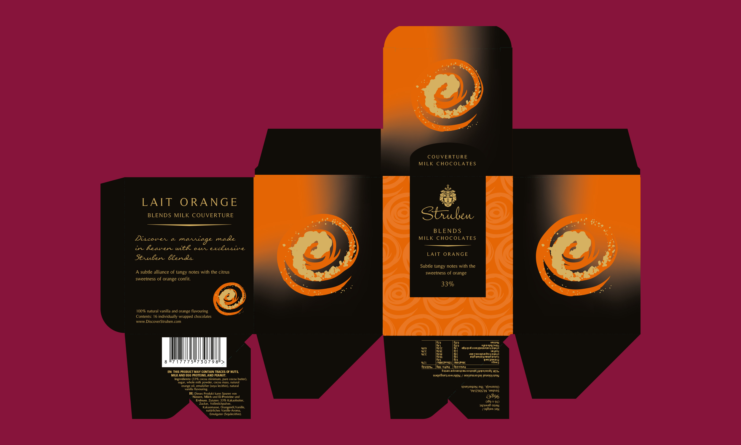
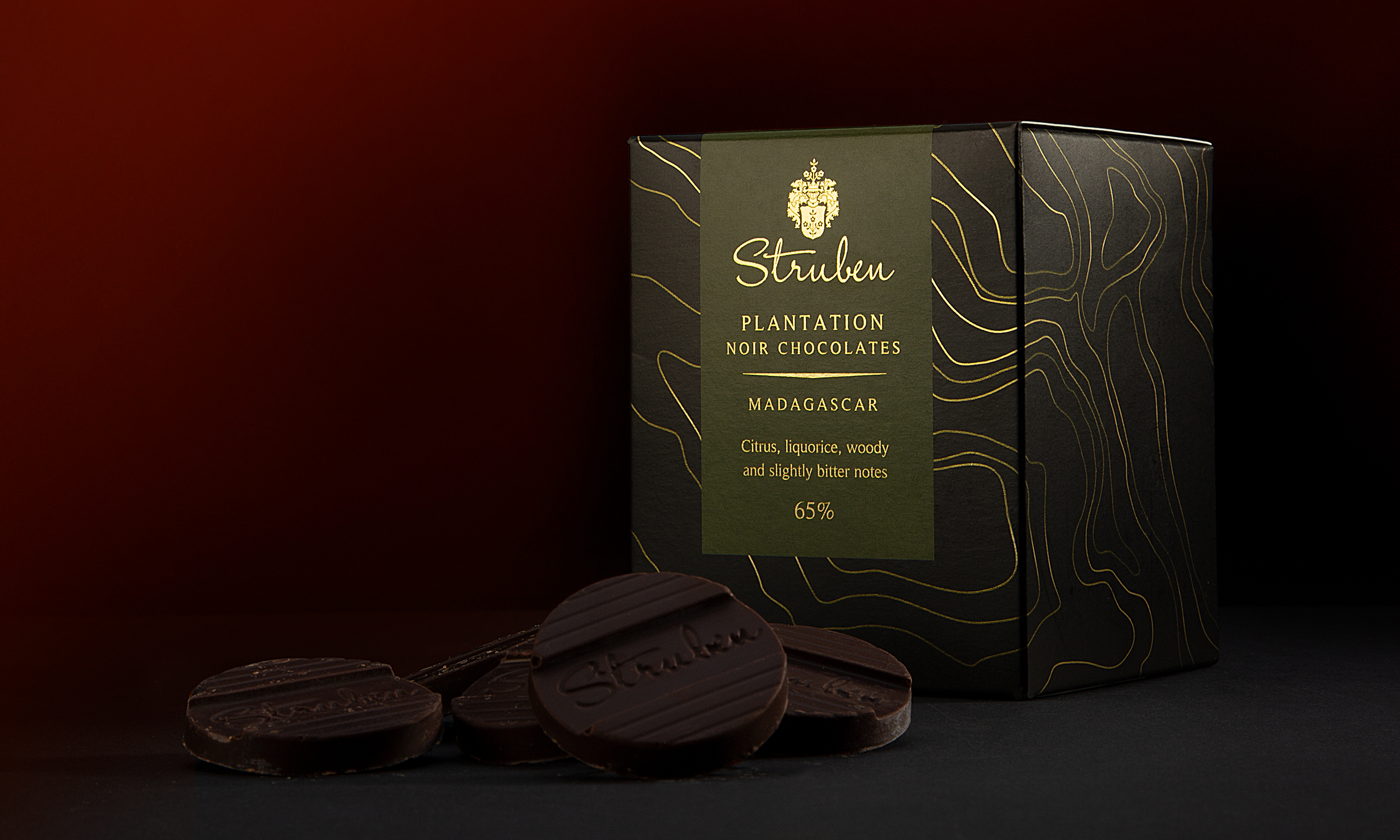
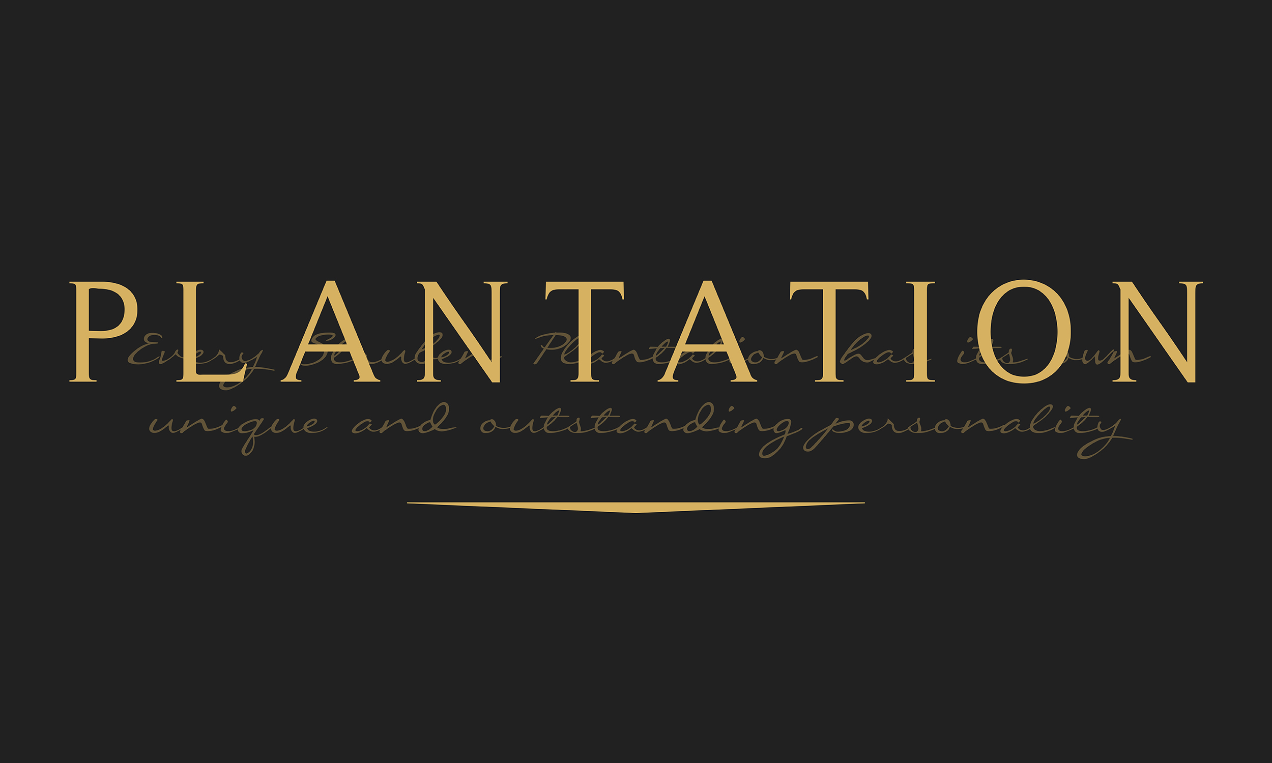
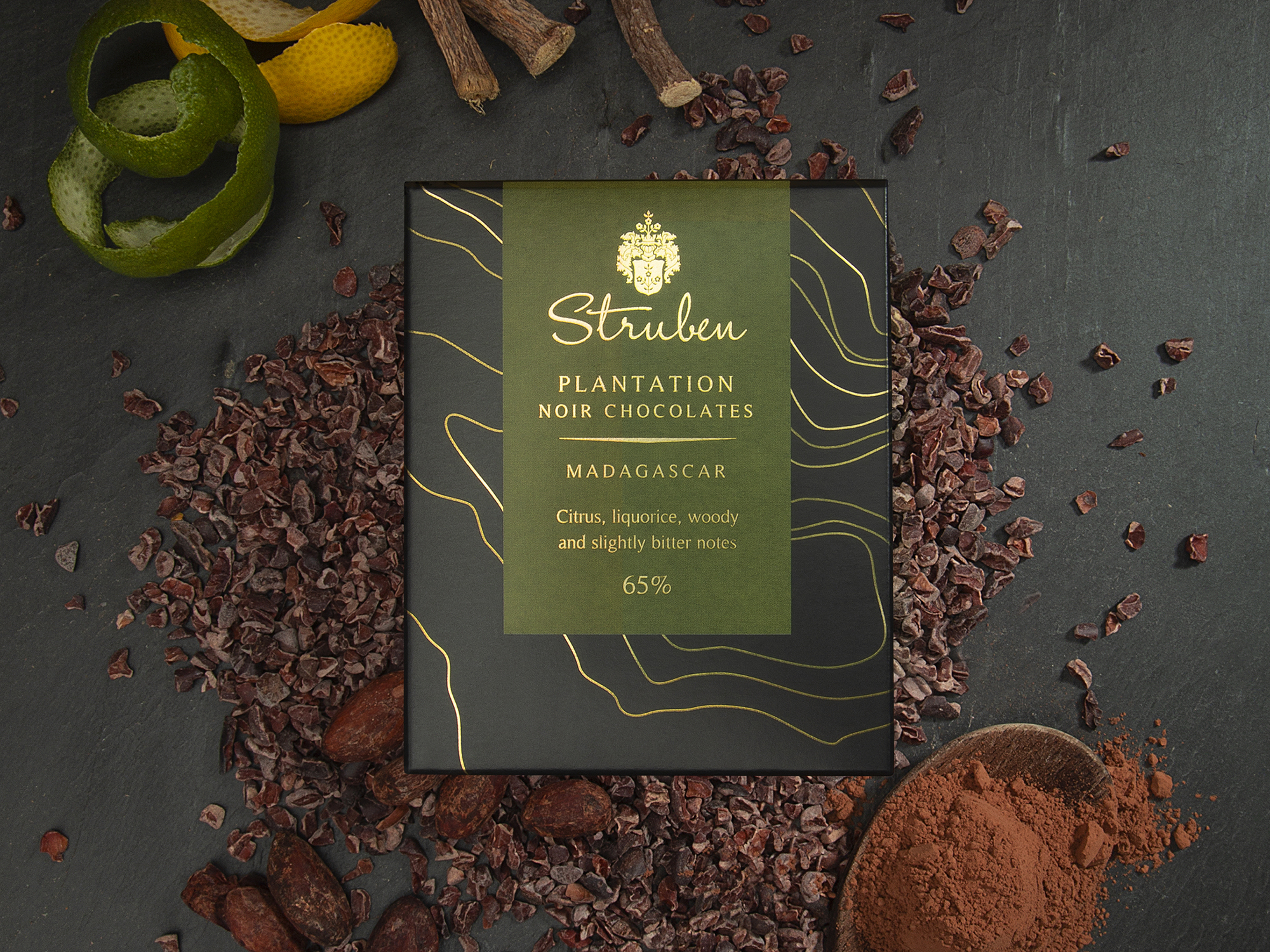
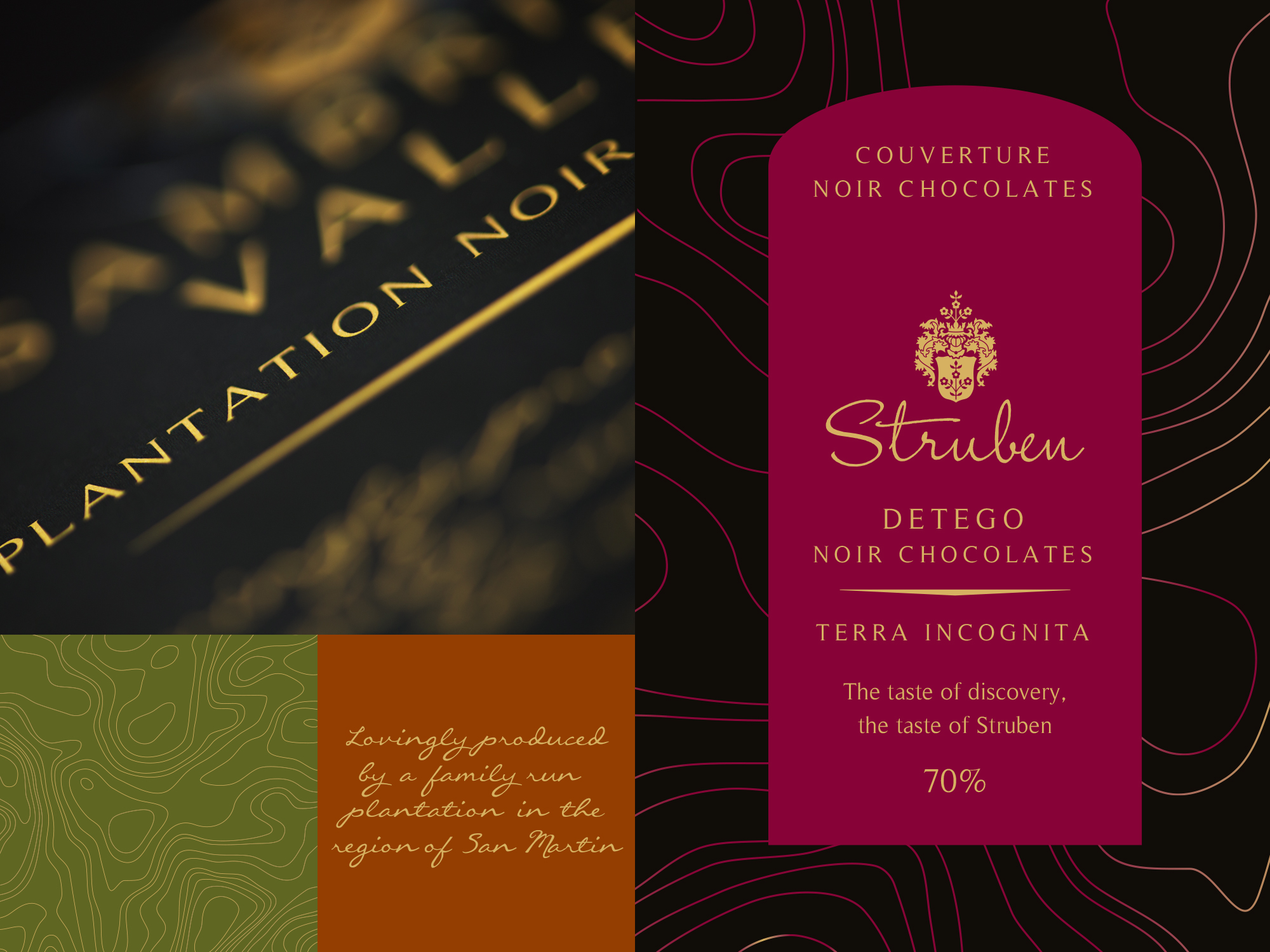
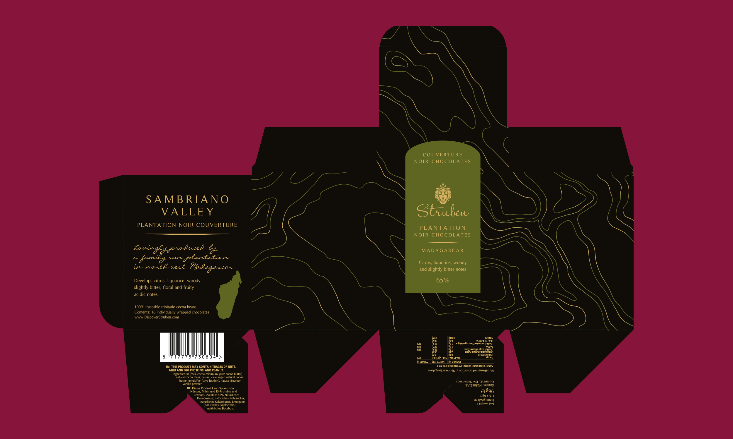
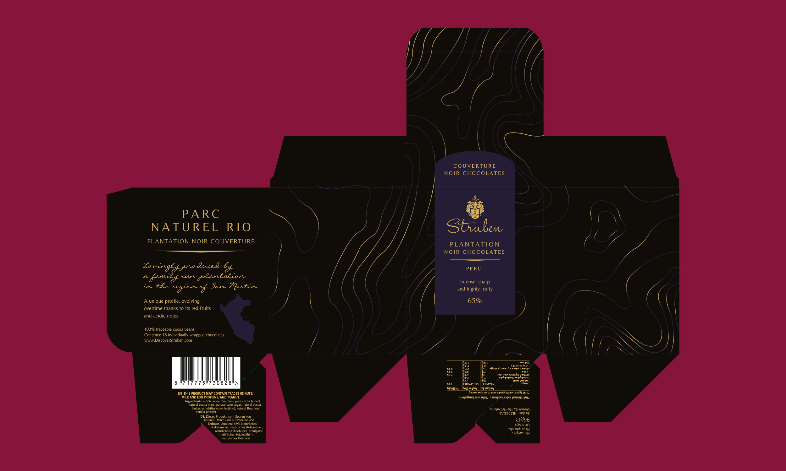
Through research and exploration around the theme, ‘The spirit of adventure’, a unified look and feel for the packaging was differentiated by three visual concepts, Plantation, Origin, and Blends. Plantation, the most premium chocolate each variant made using cocoa sourced from a specific location, map contours of the area became the narrative element for these unique packaging designs.
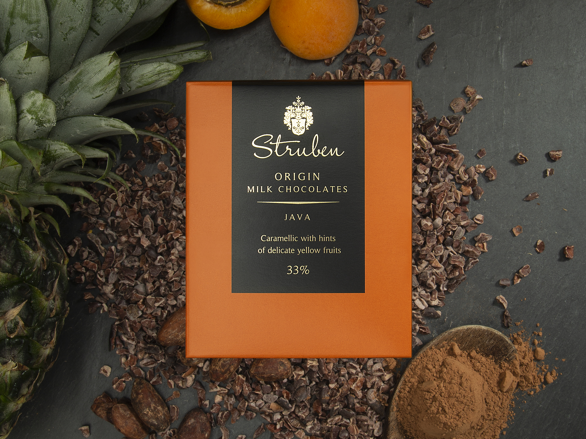
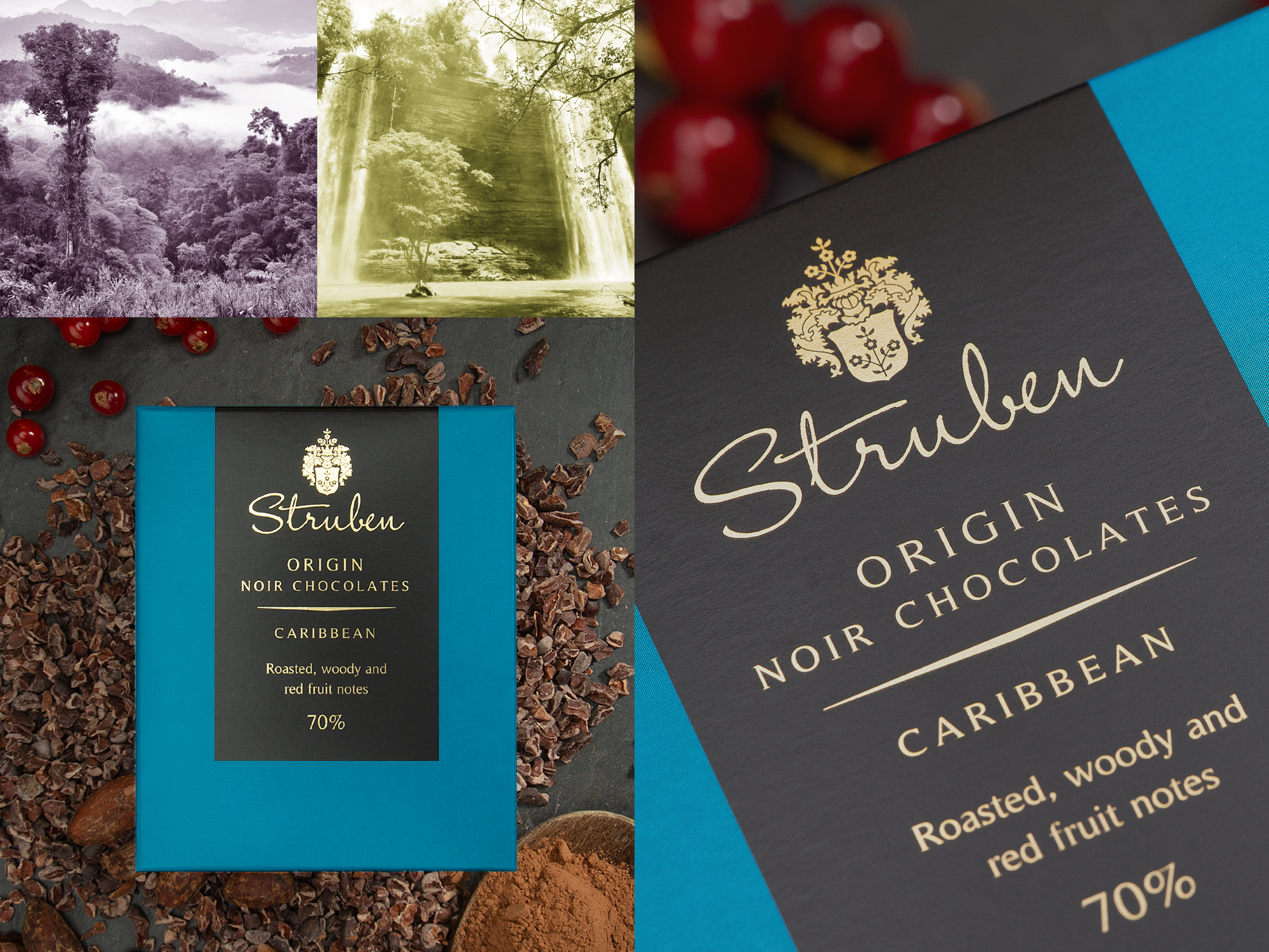
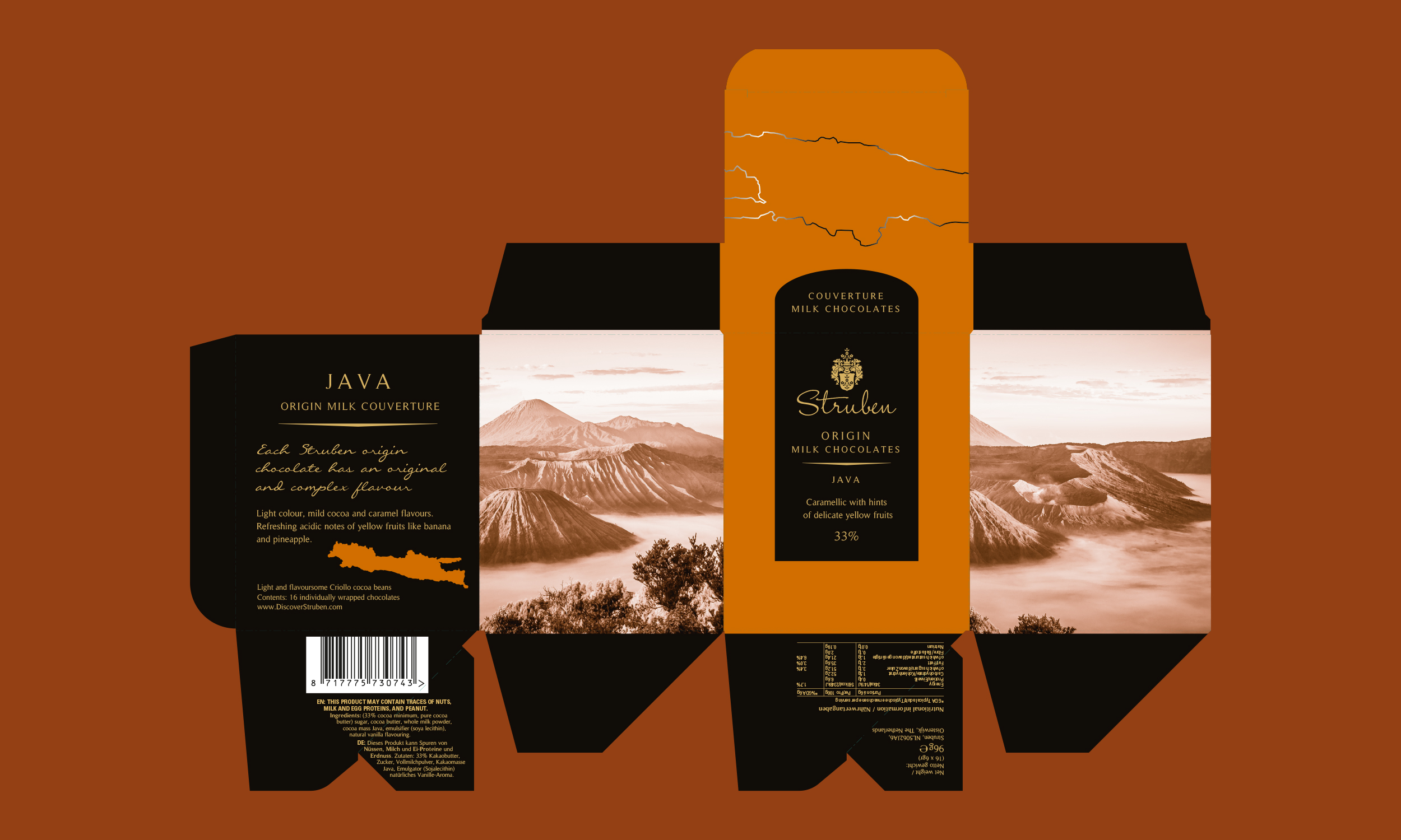
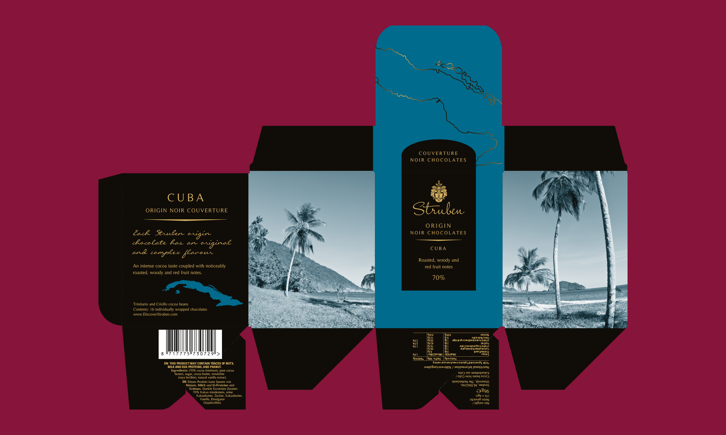
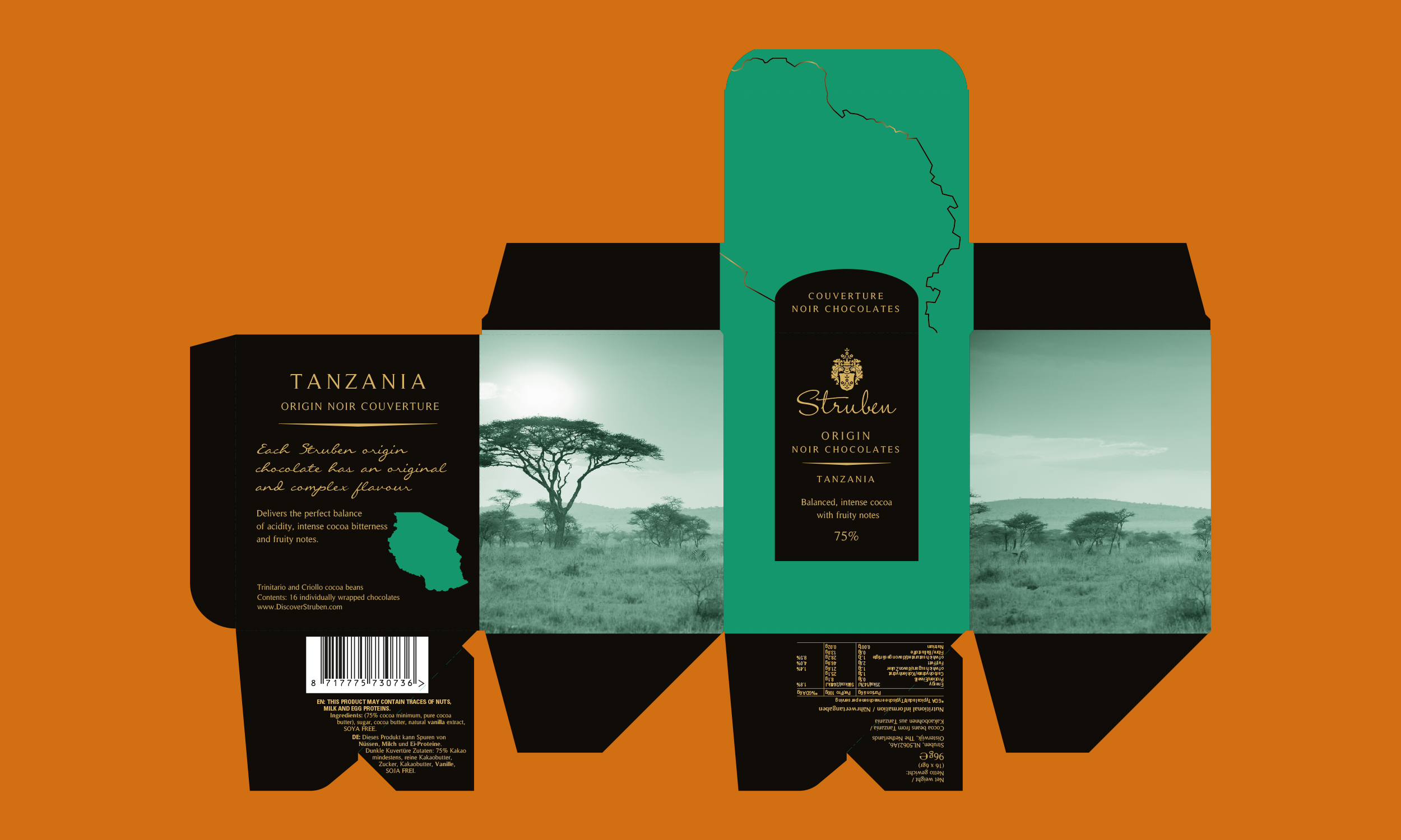
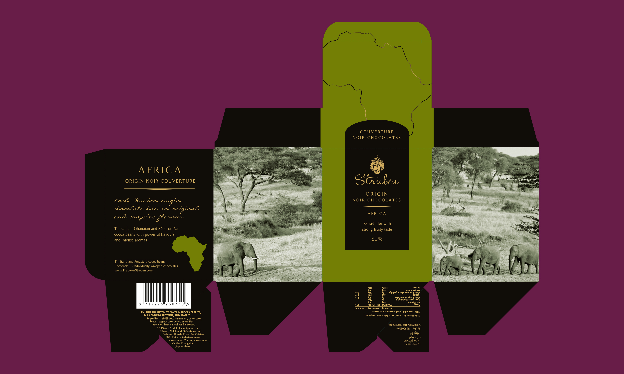
Origin chocolates are made from country-specific cocoa, each country and precise geographical location is represented photographically.
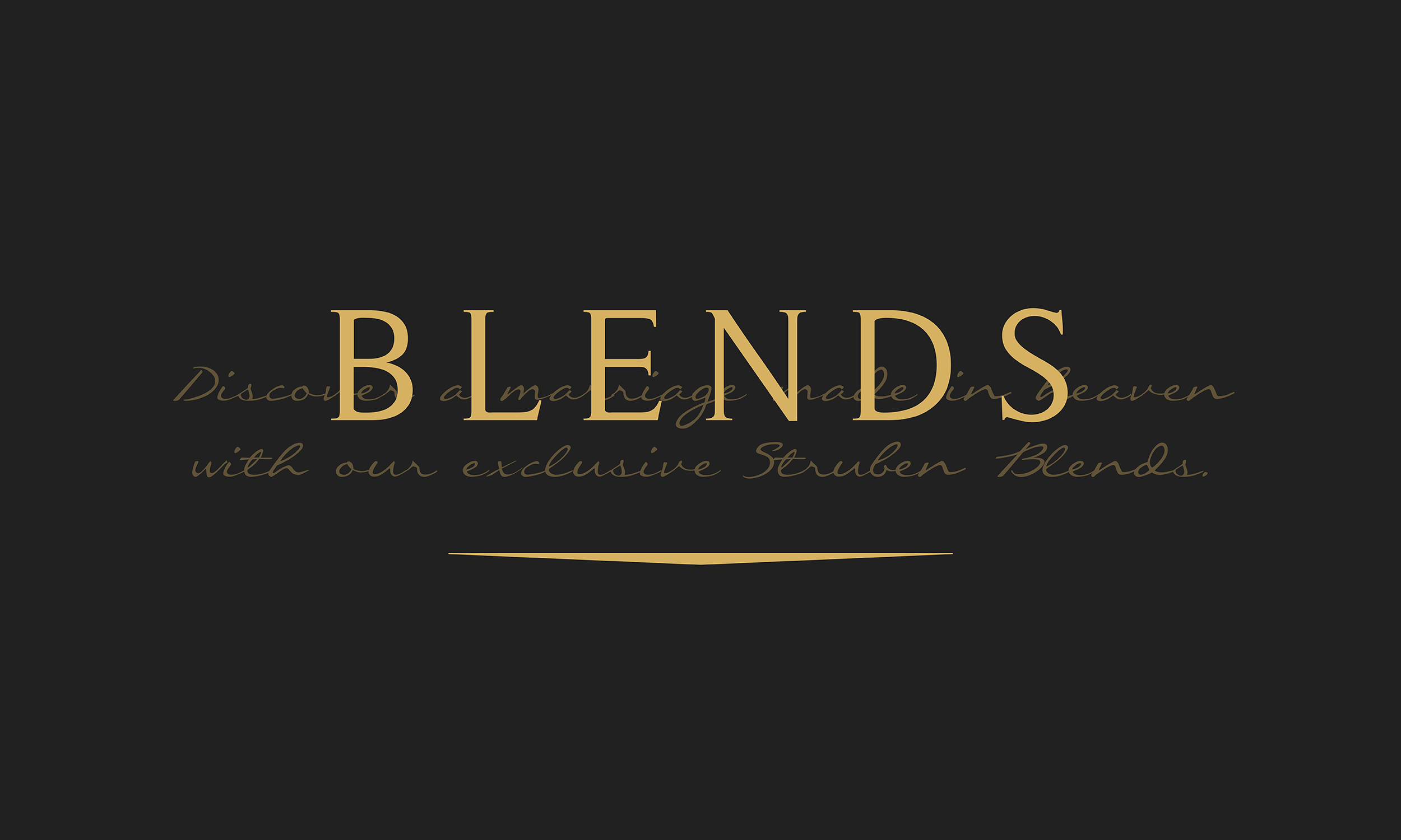
Blends see different combinations of cocoa to create a variety of flavours, this was translated visually by combing gold foil illustrated swirls with a palette of rich, sumptuous coloured swirls to mimic the actions of a prospector panning for gold.